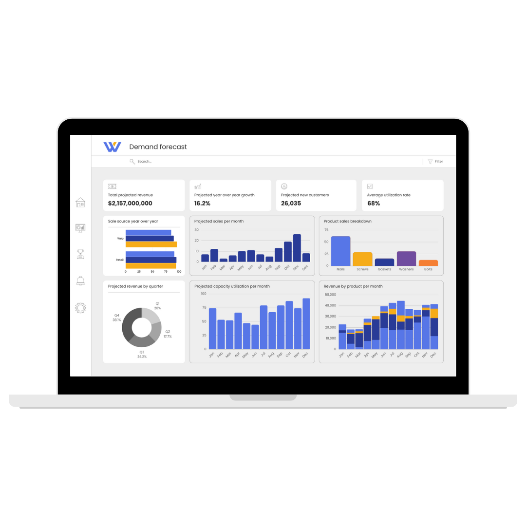
Fuel Your Business With Insights From Dashboards That Just Make Sense

With a team of experienced data analysts and designers, Wavicle combines our analytical expertise with a deep understanding of design-thinking principles and user experience to create dashboards and visualizations that are both informative and intuitive. Our commitment to fully understanding our customers’ business goals enables us to deliver customized solutions that drive growth and improve decision-making. Wavicle’s innovative mindset and ability to deliver quality results quickly make us an ideal partner for businesses seeking to harness the potential of their data.


Let our experts help you unlock the power of data visualization through custom-fit solutions built with user experience in mind. Reach out to our team to get started.

Design centric UX dashboard

Accelerate growth, identify opportunities, and discover new efficiencies with data visualizations custom-built for your business and technical users

Improve decision-making 2px

Improve decision-making by presenting data in a clear, concise manner for business and technical users

Increase adoption 2px

Increase adoption for your reporting and BI tools by providing information tailored to users’ needs

Drive efficiency 2px

Drive efficiency with visualizations that streamline workflows and eliminate distractions

Data-driven culture 2px

Build a data-driven culture across your teams with dashboards that are simple to understand

Our philosophy: UI/UX
OUR PHILOSOPHY

Wavicle’s experts prioritize UI/UX to deliver deeper insights

UI/UX is about far more than creating slick dashboards and visualization. It’s about ensuring our customers have access to the insight they need in a usable and intuitive format. In order to be effective, data visualizations must be clear, easy to use, and tailored to your unique users, so they can find answers to their most pressing questions quickly.


By focusing on user experience and design-thinking principles, we help our customers reach their goals – whether they’re focused on growth, profitability, efficiency, or another critical metric – with usable, understandable dashboards and reports that answer all the right questions.

SUCCESS STORY

McDonald’s orders up data-driven solutions with intuitive visualizations

Active in 65 world markets, McDonald’s needed a bigger, more scalable analytics environment to manage its global data, run intuitive executive reports, and fuel business insights about everything from menus and promotions to kitchen design and supply chain. They partnered with Wavicle to develop a robust, scalable environment that provides a single source of truth and user-friendly reports and visualizations.


Discover how Wavicle’s team built the analytics and reporting environment McDonald’s needed to enable data-driven decision-making across the globe.

Success story

Provide the clear, actionable insights your team craves with the BI and reporting tools that best fit your needs

tableau logo
AWS Partner Amazon QuickSight Delivery
power-bi logo

News, insights, and results

case study

Global manufacturer visualizes key procurement metrics for faster decisions and cost savings

blog

Clear and actionable: Wavicle’s winning visualization challenge dashboard

case study

McDonald’s optimizes food delivery performance with valuable visualized metrics

news

Wavicle launches converter to automate and accelerate Tableau to Amazon QuickSight conversions

Transform data into insights and actions with a reporting UI/UX tailored to your team and your business